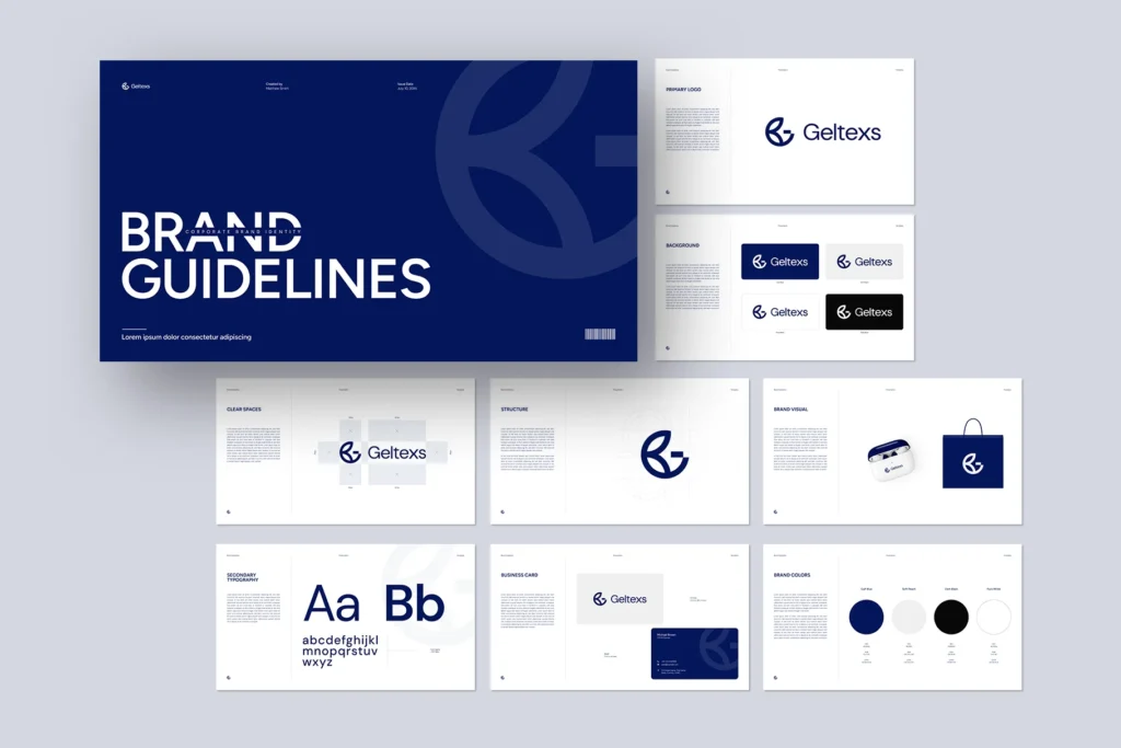
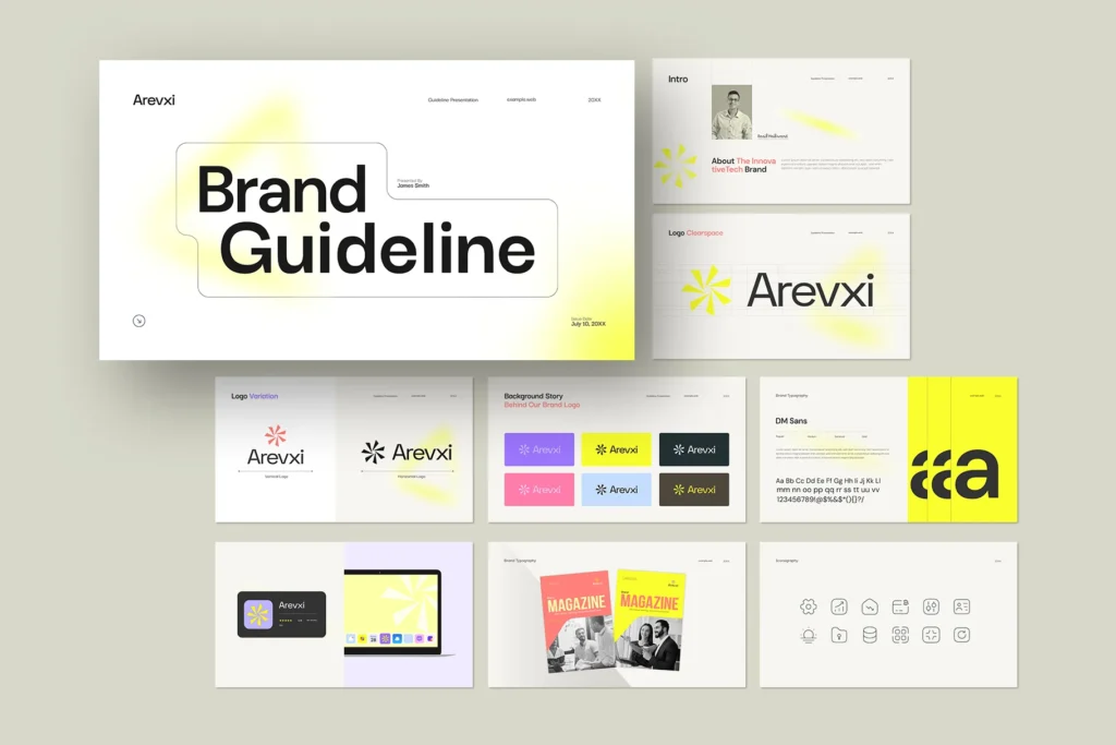
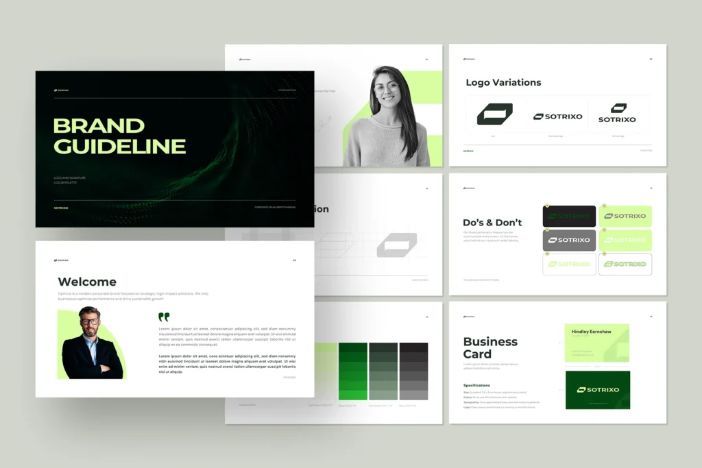
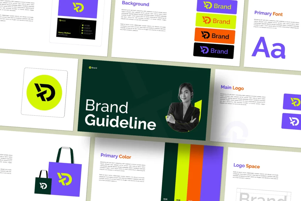
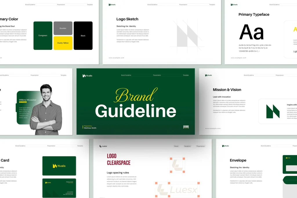
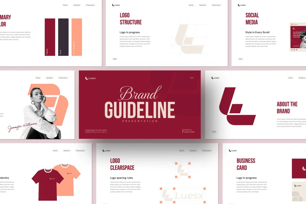
According to GraphyPix LLC, creating a strong and consistent brand guideline in today’s competitive market is more important than ever. A brand guideline is your blueprint for ensuring that your brand remains bold across all platforms, from social media to print materials. However, what is a brand guideline, and why is it important? Let’s dive in.
What are brand guidelines?
It’s pretty much a thorough guide that lays out the rules and benchmarks for how your brand looks and sounds. It makes sure everything stays the same, from how you use your logo to the way you talk. You can think of it as a “how-to guide” for your brand’s personality.
For example, companies like Spotify, Apple, and Google have meticulously crafted brand guidelines that help them maintain their unique identities. You can explore more about this at Graphypix, where they emphasize the importance of visual branding.
Why Are Brand Guidelines Important?

Brand guidelines are not just a set of rules—they are the backbone of your brand’s identity. They ensure that every touchpoint with your audience reflects the same values, tone, and visual elements. Here’s why they are so crucial:
1. Builds Trust and Credibility in Brand Guideline
When your brand is consistent, it sends a message to your audience that you are reliable and professional. For example, if your logo changes color or style frequently, customers might question whether they’re interacting with the same company. Building trust takes time, but once it’s there, people will be loyal. According to specialists, brands that maintain consistency in their messaging and visuals see higher customer retention rates.
2. Enhances Brand Recognition
Think about some of the most recognizable brands in the world—Apple, Nike, Coca-Cola. What makes them stand out? Their consistent use of logos, colors, and messaging. A good brand guideline makes sure that your logo, fonts, and color scheme are always used properly, which makes your brand easy to spot. This recognition is key to standing out in a crowded marketplace.
3. Streamlines Internal and External Communication
Without clear guidelines, different teams (or even external partners like freelancers or agencies) may interpret your brand differently. This can lead to inconsistent messaging, which dilutes your brand’s impact. An in-depth brand guideline gives everyone who represents your brand a single source of truth. As noted by brand experts, having a centralized guide helps streamline communication and ensures that all stakeholders are on the same page.
4. Boosts Marketing Efficiency
When all team members stick to the same rules, marketing efforts have a bigger impact. Staff don’t spend hours arguing about typefaces or shades because those choices are set in stone. This keeps your team from having to start from scratch every time so they can focus on planning and execution.
5. Supports Scalability
As your business grows, maintaining consistency becomes more challenging. A brand guideline makes sure that your brand stays consistent as you move into new markets or release new goods. It’s especially useful when working with remote teams or international offices, where cultural differences could otherwise lead to misinterpretations of your brand.
Want to learn how to build your own brand guideline from scratch? Check out templates we created with our friends at GraphyPix.
What should be included in brand guidelines?

To make a good brand guideline, you need to list a few important things:
Brand Story
Your story is the foundation of your brand guidelines presentation. It explains who you are, what you stand for, and why you exist. For instance, Mailchimp’s brand story focuses on empowering small businesses through creativity and simplicity.
Logo Guidelines
Logos act as your brand’s signature. Specify rules for size, spacing, and placement to ensure proper use. Discover our blog for expert advice on creating powerful logo guidelines.
Color Palette
Colors evoke emotions and convey meaning. Explain the HEX, RGB, and CMYK codes for primary and secondary colors. For inspiration, see how brands like Google use vibrant yet harmonious palettes.
Typography
Fonts play a huge role in readability and personality. Choose fonts that align with your brand’s tone—whether modern, playful, or professional.
Image Guidelines
Establish standards for photography, illustrations, and data visualizations. This ensures visuals align with your brand’s aesthetic.
Brand Voice
Decide whether your tone will be formal, casual, humorous, etc. Consistency in messaging strengthens your connection with the audience.
Enough of information; let’s head out to create an awesome brand guideline from top to bottom.
For More Brand Guidelines Template Visit :
$22.00
Brand Guideline Presentation Template
$24.00
Brand Guideline Presentation Template
$22.00
Brand Guideline Presentation Layout
$20.00
Corporate Brand Guideline Template
$22.00
Modern Brand Guideline Presentation
$18.00
5 Steps of Creating a Brand Guideline

It doesn’t have to be hard to make a brand guideline. Follow these steps to get started on your best brand guidelines template PDF:
Step 1: Collect Brand Guideline Inspiration
Look at successful brands for brand guideline templates. Study their structure, design, and content. Websites like GraphyPix offer excellent case studies.
Step 2: Define the 6 Essential Brand Guide Elements
Let’s break down each element of the brand usage guidelines template further:
Element 1: Brand Story Outline
Your story should answer three questions: Who are we? What do we do? Why does it matter? Make it compelling enough to inspire both employees and customers.
Element 2: Logo Guidelines for brand guideline
Include variations of your logo (e.g., horizontal vs. stacked), minimum sizes, clear space requirements, and examples of incorrect usage in a one-page brand guidelines template.
Element 3: Brand Color Palette
List your main colors and provide alternatives for different mediums (print vs. digital). Tools like brand guidelines template Canva can help you choose complementary shades.
Element 4: Typography and Font Guidelines
Specify font families, weights, and sizes for headings, subheadings, and body text. Ensure accessibility by choosing legible fonts.
Element 5: Image Guidelines
Describe the types of images that fit your brand guidelines. For example, if you’re targeting millennials, opt for bright, energetic photos over muted tones.
Element 6: Brand Voice
Provide examples of phrases or sentences that reflect your tone in the branding guideline template. For instance, Zendesk uses friendly, approachable language to connect with users.
Step 3: Listing other Brand Materials for your Guide
Consider including guidelines for business cards, email signatures, social media posts, and even packaging designs.
Step 4: Outline Your Guide
Organize your content logically. Start with foundational elements like the brand story, then move on to specifics like typography and imagery.
Step 5: Make Plans for Your Brand’s Development
Brands evolve over time. Leave room in your guide for updates without compromising core principles. You can use tool-based templates (like the brand guidelines Photoshop template or brand guidelines Word template) to get started.
Brand Guidelines Examples
Check out the brand guidelines agency from here:
Spotify: Famous for its eye-catching green shade and lively images, Spotify’s guide shows its groundbreaking character.
Apple: Simple and polished, Apple’s guide focuses on neat lines and top-notch visuals.
Google: Fun but still professional, Google’s guide displays its wide range of products.
You can find templates and samples at the brand guidelines website GraphyPix LLC.
Value of Consistent Brand Identity Throughout Channels

These days, consumers engage with brands across a variety of touchpoints—social media, websites, email campaigns, print materials, and even physical stores. Each time they interact with you, their perception of your brand evolves. When these interactions don’t match, it confuses your audience while your brand loses its impact. Here’s why it is so important to maintain consistency across all the channels:
1. Creates a Unified Customer Experience
Your customers should feel like they’re interacting with the same brand, no matter where they encounter it. Whether they see an Instagram post, visit your website, or receive a printed brochure, the experience should be seamless. Designing, speaking, and writing in a way that is consistent with your brand helps people connect with you on an emotional level.
One example would be Apple, whose minimalist brand guideline shines through in everything from product packaging to its website. This standardization ensures a consistent customer experience that enhances brand loyalty.
2. Boosts Emotional Bonds
A strong brand guideline can facilitate emotional ties with your audience. When this happens, people start to connect your brand with specific feelings, values, etc. For example, Spotify’s bold green color and playful tone evoke creativity and energy, while Starbucks’ warm tones and cozy imagery suggest comfort and community.
With the brand guidelines InDesign template, brands can maintain consistency in their visual and verbal identity and see higher engagement rates because customers feel more connected to the brand.
3. Improves Recall and Retention
Humans are wired to remember patterns. When your brand consistently uses the same colors, fonts, and messaging, it becomes easier for customers to recall your brand. This is particularly critical in highly competitive businesses where differentiation is essential. For example, Coca-Cola’s iconic red and white color scheme has been consistent for decades, making it one of the most memorable brands globally.
4. Reduces Confusion in Multi-Channel Marketing
With so many platforms, it’s easy for brands to lose control over how they’re perceived. Inconsistent branding across channels muddies the waters for customers and dilutes your message. For instance, if your social media is playful, but your website reads formal and corporate, customers may struggle to understand who you are. A strong brand guideline keeps your tone, visuals, and messaging all on track, no matter where you are.
5. Supports Omnichannel Strategies
Omnichannel marketing is about creating a smooth and seamless experience for your customers, no matter where they interact with your brand—whether that’s in-store, on your website, or through social media. The secret to making it work? Consistency. When your brand feels the same everywhere, customers know what to expect, and that builds trust. Think of it like this: whether they’re walking into your shop, scrolling through your Instagram feed, or exploring your website, they should feel like they’re having the same great conversation with your brand every step of the way.
Looking for design help?
Check out our design service options and bring your brand ideas to life today. Contact for brand guidelines booklet today.
Develop Visual Brand Guidelines in 7 Steps

Designing your visual brand identity is about more than choosing colors and font combinations—it’s about creating a cohesive aesthetic that embodies your brand’s voice. Follow these steps to create successful guidelines for a visual brand identity:
1. Propose a Brand Logo Placement and Usage Guidelines
Your logo is the center of your brand guidelines cover. It should be simple, memorable, and versatile enough to work across different mediums (digital, print, merchandise, etc.).
Include specific guidelines for logo placement, sizing, spacing, and variations (e.g., horizontal vs. stacked). Also, specify what NOT to do—like altering the logo’s colors or proportions.
Example: Mailchimp’s brand guidelines illustrator template includes detailed instructions on spacing and clear zones around the logo to maintain its integrity.
2. Pick a Brand Color Palette
Colors evoke emotions and convey meaning. Pick a main color scheme that shows what your brand stands for and how it acts. For example, blue often represents trust and professionalism, while yellow suggests optimism and energy.
Provide exact color codes (HEX, RGB, CMYK) for both digital and print use. Also, include secondary colors for accents or highlights.
Resource: Adobe offers excellent tips on selecting and using brand colors effectively.
3. Choose Brand Fonts That Reflect Your Unique Identity
The choice of typography is crucial in defining the tone of your brand. Modern sans-serif fonts like Helvetica convey simplicity and professionalism, while script fonts add elegance and creativity.
Limit yourself to 2-3 fonts to avoid clutter. To guarantee readability and consistency, specify font weights and sizes for the body of the text, subheadings, and headings.
Example: Google’s brand guidelines specify clear rules for font usage, ensuring a clean and modern aesthetic across all platforms.
4. Select Branded Iconography That Represents Your Niche
Icons might be tiny, but they have a huge impact on enhancing the user experience. You can think of them as small visual aids that direct your audience and give your design some character.
When you select icons, go for ones that seem to match your brand. For example, if you run a tech company, you might prefer streamlined and simple icons. But if you’re in charge of a lifestyle brand, something that looks hand-drawn or fun could feel more genuine and captivating.
The main thing is to keep it uniform—make sure all your icons have the same look, whether that’s in how thick the lines are, what colors you use, or the overall feel. When everything looks like it belongs together, it not only appears neat but also makes the experience more straightforward and fun for the people using it.
5. Set Photography and Videography Style Guidelines
Visual content is a critical part of your brand identity. Decide on the type of imagery that best represents your brand—whether it’s candid shots, studio portraits, or abstract compositions.
Specify guidelines for lighting, angles, filters, and subject matter. For example, Airbnb’s photography guidelines emphasize authentic, natural images that showcase real experiences.
Don’t forget to include rules for video content, such as transitions, music, and voiceovers.
6. Collect Web-Specific Brand Guideline Elements
Websites need special attention to things like button styles, navigation menus, and designs for calls to action (CTAs). These elements should match your overall brand identity. Set up rules for responsive design, animations, and hover effects to make sure users have a smooth experience on all devices.
Example: Shopify’s web rules give detailed steps for UI parts such as buttons and banners, which keeps the look and feel the same across the site.
7. Create Shareable Brand Guidelines Tied to Your Brand Story
Once you’ve defined all the visual elements, compile them into a shareable document or online portal. Make sure the guide is easy to access and update.
Tie everything back to your brand story to give context to the visual elements. Explain why certain colors, fonts, or imagery were chosen and how they reflect your brand’s mission and values.
Websites like Canva or GraphyPix can help you create visually appealing guides that are both functional and inspiring.
Don’t Forget, Better Brand Guidelines Get Results!
When you follow these steps and use the ideas from GraphyPix LLC, you’ll be ready to make a strong brand guideline that lasts. Keep in mind, your brand is more than just a logo—it’s something people experience. Browse our website, search from 50,000+ templates, and get free & premium templates for your design needs.
People Also Ask
1. What makes a good brand guideline?
Good template brand guidelines are easy to understand, brief, and flexible. It includes all key parts while allowing for future changes.
2. How often should I update my brand guidelines?
Look over your guide once a year or when your brand strategy changes a lot.
3. Can I create a brand guideline myself?
Sure! Hiring experts can boost quality, but homemade guides work fine for smaller companies.
4. Where can I find brand guideline templates?
Sites like GraphyPix and Creative Market offer templates you can change to make the process easier.
5. Why is consistency so important in branding?
Consistency reinforces recognition and trust, making it easier for customers to engage with your brand.
6. What’s the difference between brand guidelines and brand positioning?
Brand guidelines focus on execution (how things look/sound), while brand positioning defines your niche and value proposition.

